Meridian 94/100
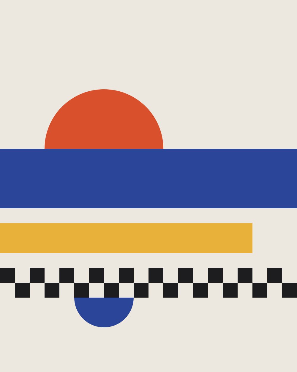
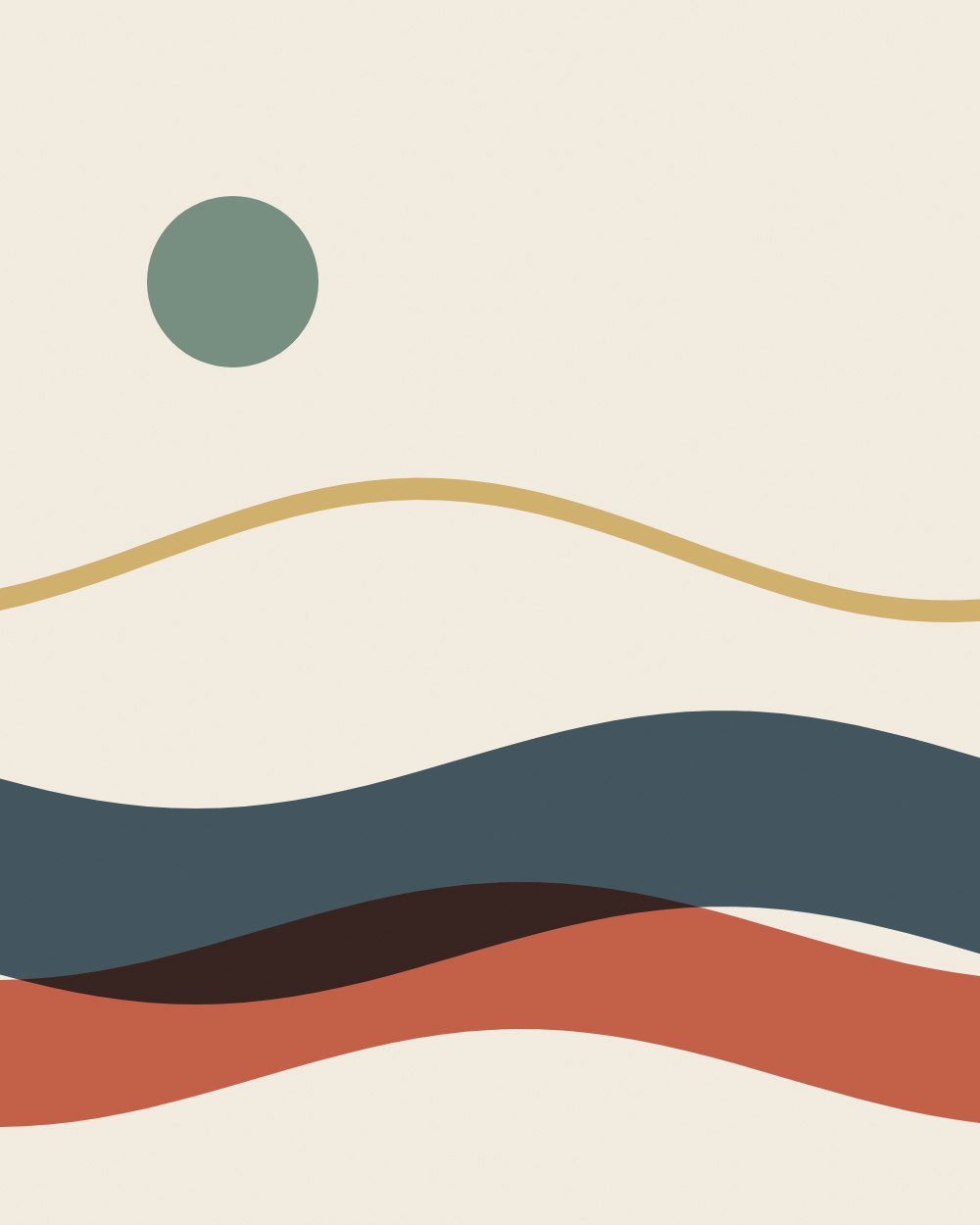
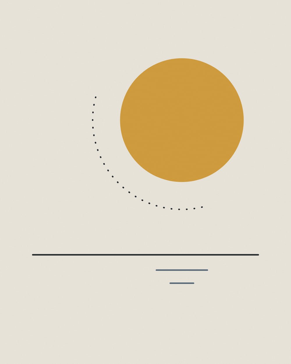
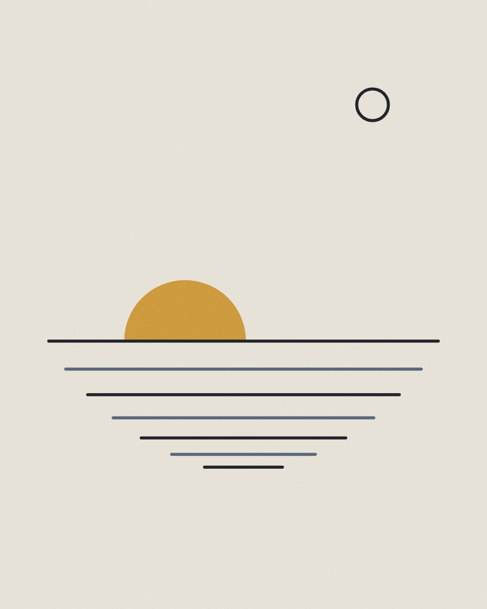
Quiet sun-and-horizon line work for hotels and lobbies.
- The white ground of the prints stands clear of the wall
- Ochre accents play against the navy wall
Art for navy
Navy is the most popular deep color in hospitality: rich, calm and flattering at night. It pairs with brass and with art that carries ochre, terracotta or cream, the warm opposites of blue.
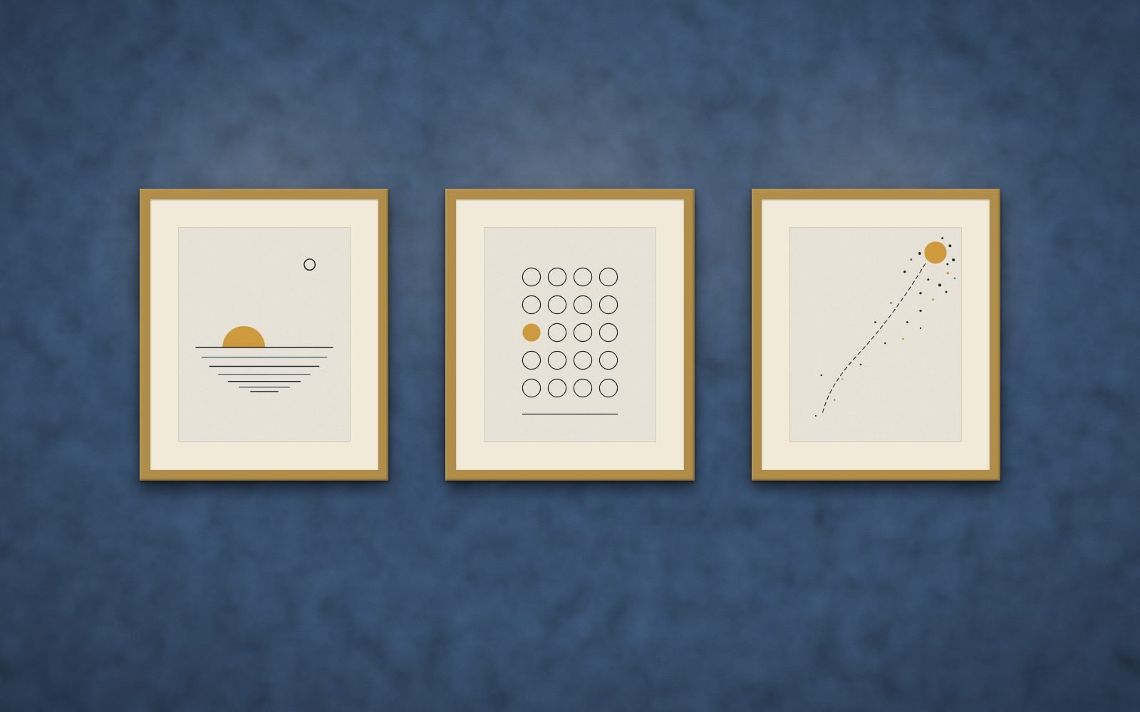
Ranked from the measured colors of every print against a navy wall (#26364B). Score your exact paint color or try a photo of your wall.
Quiet sun-and-horizon line work for hotels and lobbies.
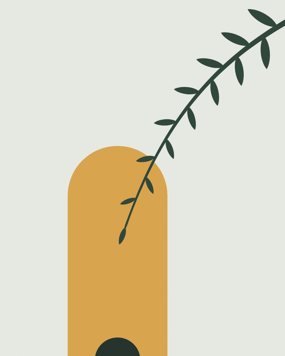
Modern botanical studies for wellness studios and clinics.
Bauhaus-inspired geometry for coworking, education and tech offices.
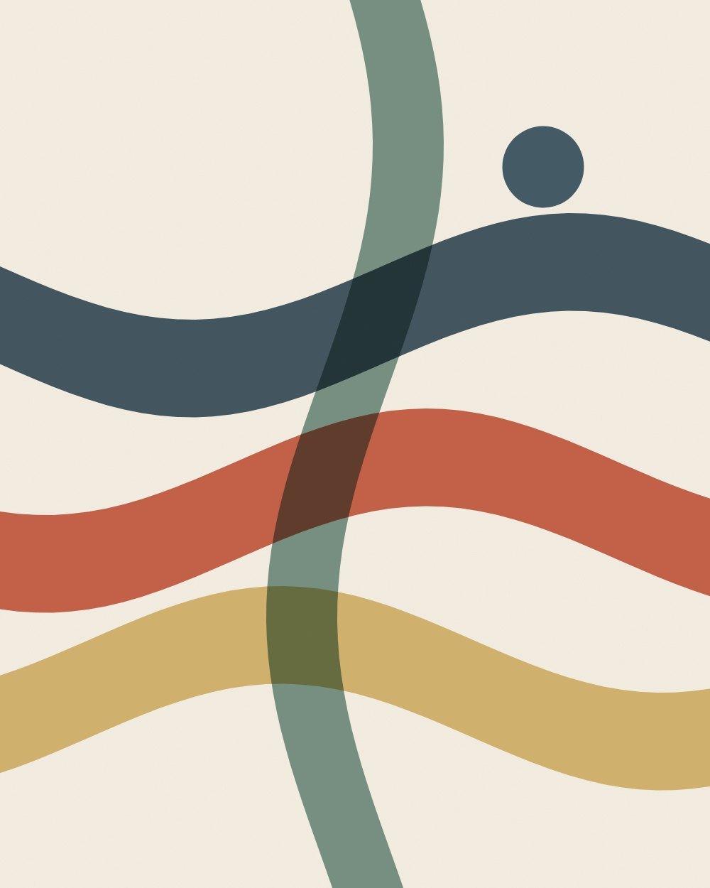
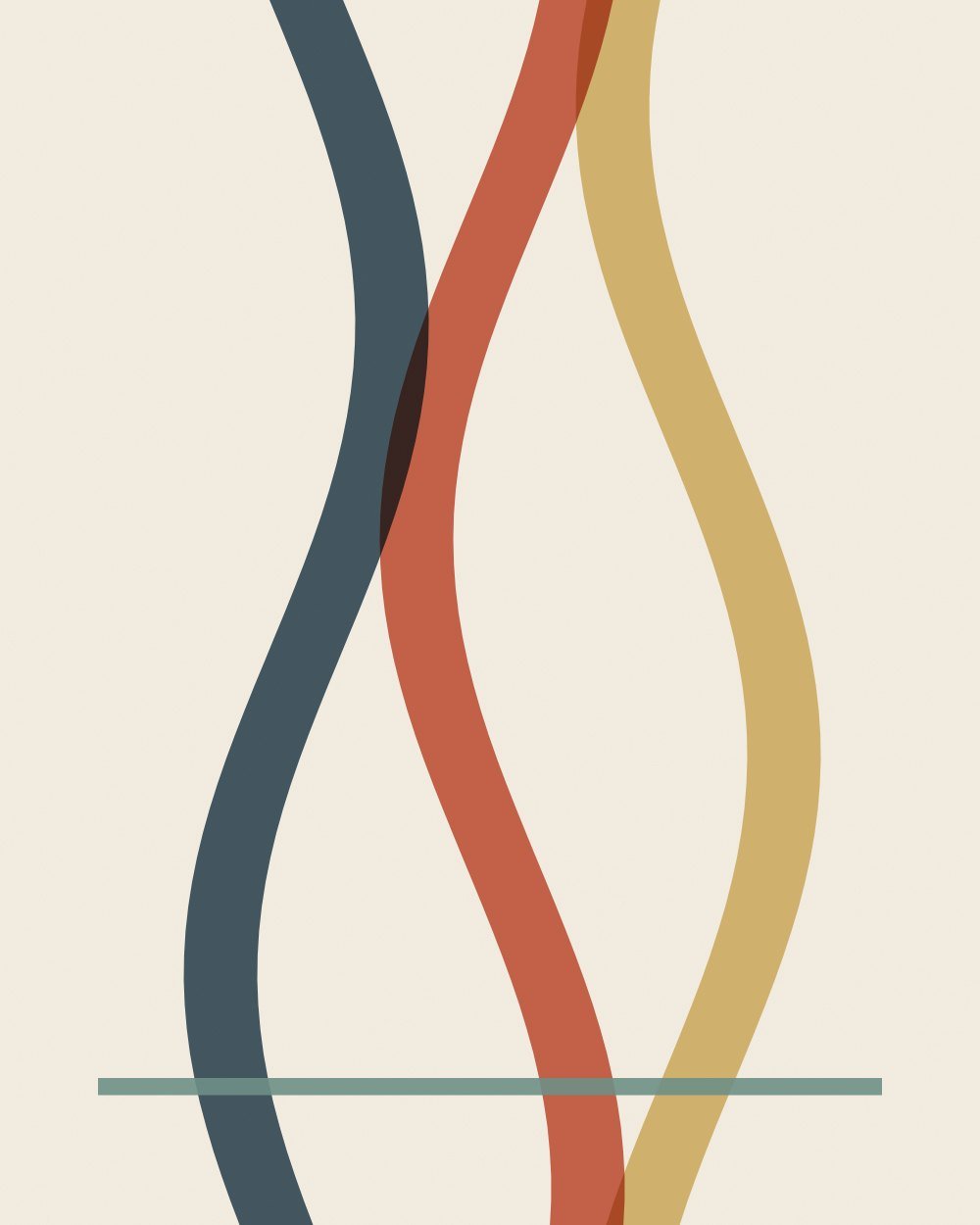
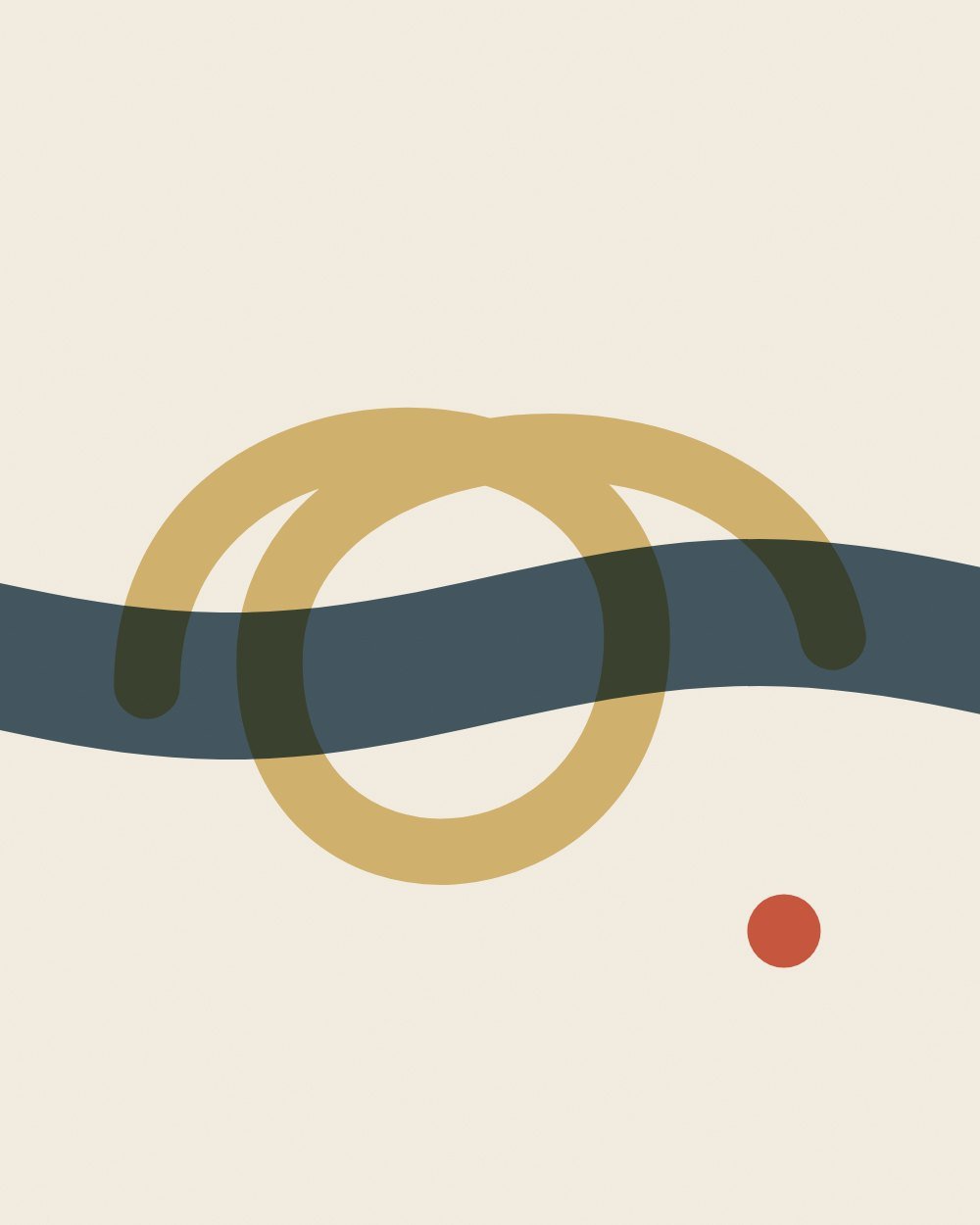
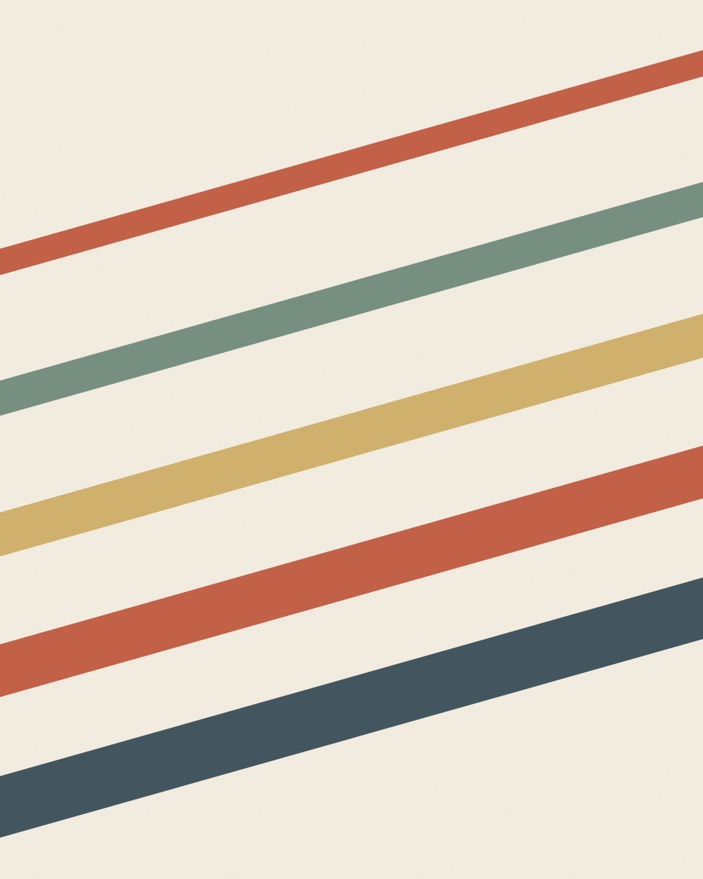
Layered translucent bands in navy, clay, ochre and sage for restaurants, hotels and lounges.
Restaurants · Bars and lounges · Hotels and boutique hospitality · Offices · Retail and boutiques. Each venue page covers counts, sizes and hanging heights for that kind of room.
Cream or white grounds with ochre, mustard, terracotta or coral accents, which are the warm complements of blue.
Yes. Gold or brass on navy is a classic pairing for restaurants, bars and hotels.
Every print was measured, not tagged: its colors were clustered in CIE Lab space and compared with the wall using CIEDE2000, the color-difference formula print shops use. Each bundle gets three scores. Presence: does the print stand out from this wall at a glance. Harmony: do its accent hues complement or echo the wall. Undertone: do warm and cool undertones agree. The overall match weights them 40, 35 and 25.
Exposed brick Painted white brick Concrete White subway tile Light wood slats Dark wood paneling Bright white Warm white Greige Light gray Charcoal Black Sage green Forest green Terracotta Blush pink Pale blue