Greige, the gray-beige on more rental and commercial walls than any other color, is a light neutral with a warm undertone. It is forgiving, but low-contrast art sinks into it.
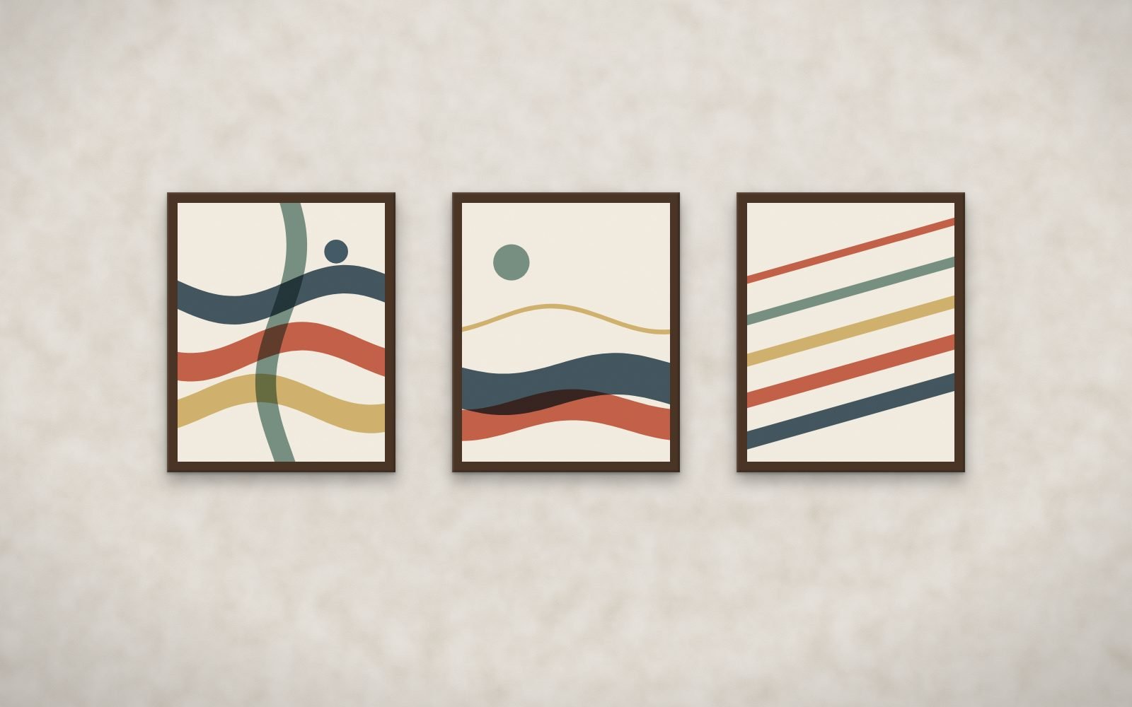
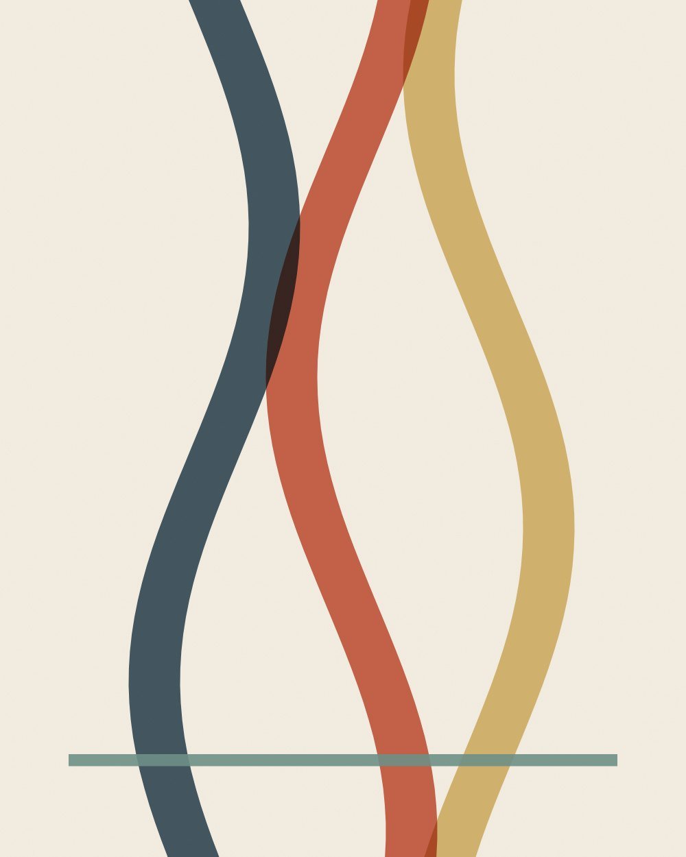
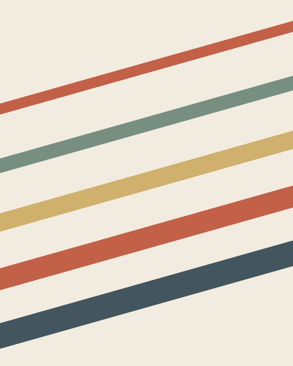
Top match on greige: Ribbon Weave, framed in walnut. Rendered from the actual prints.
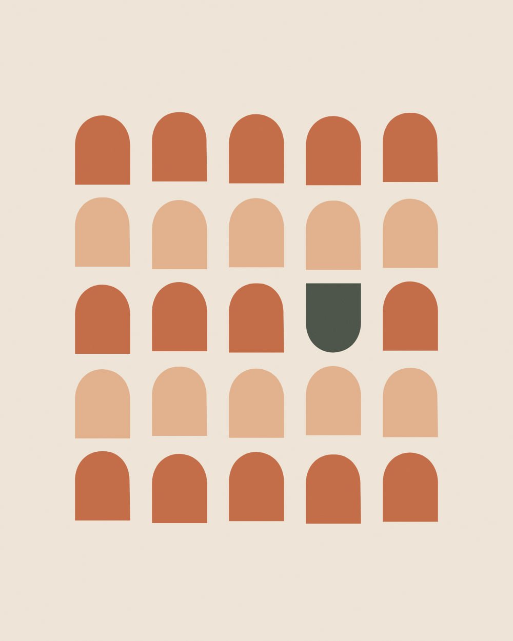
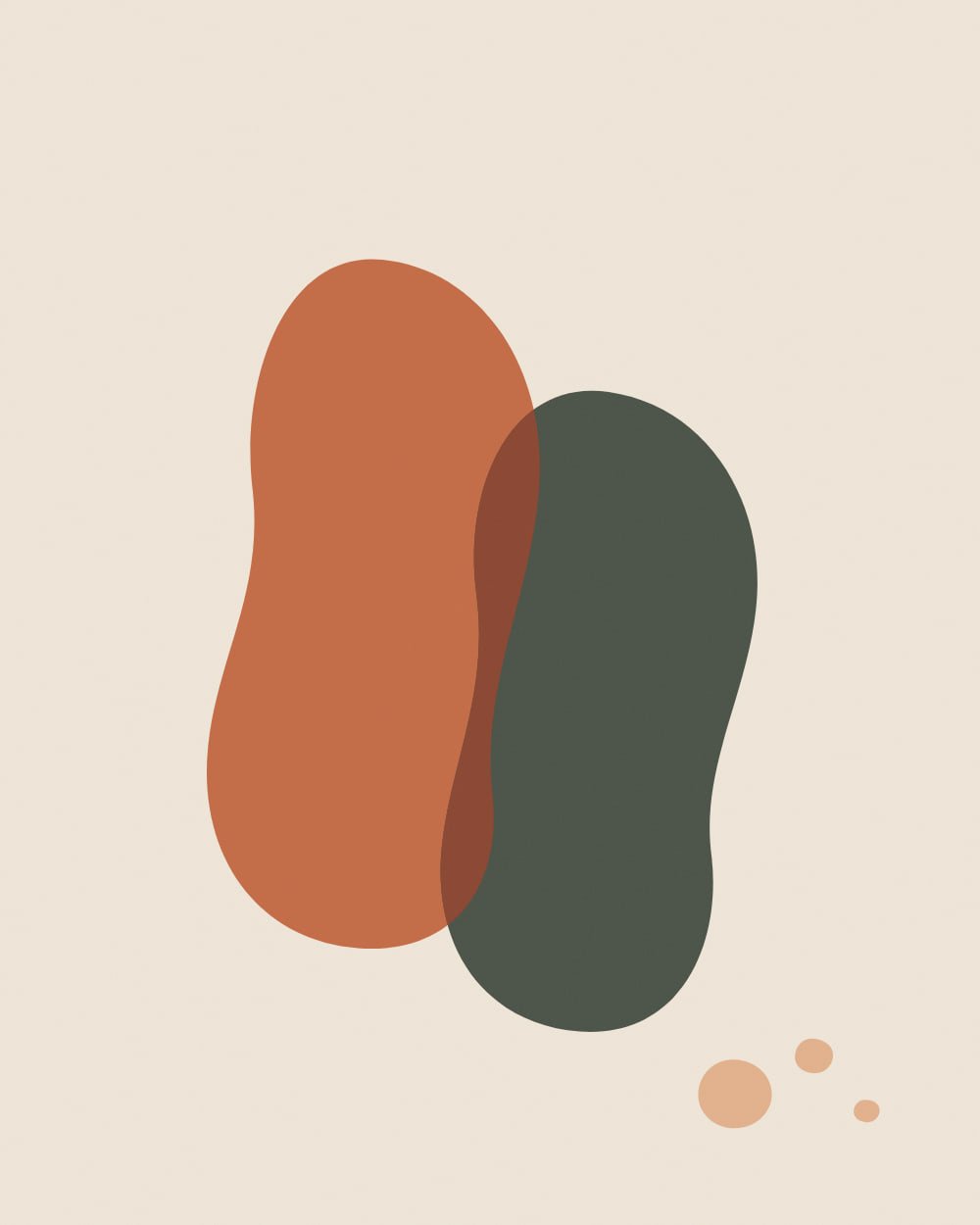
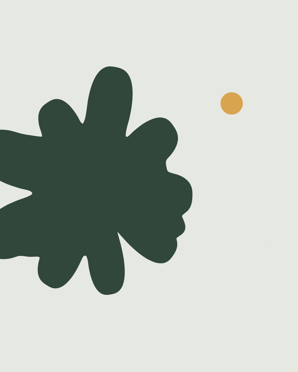
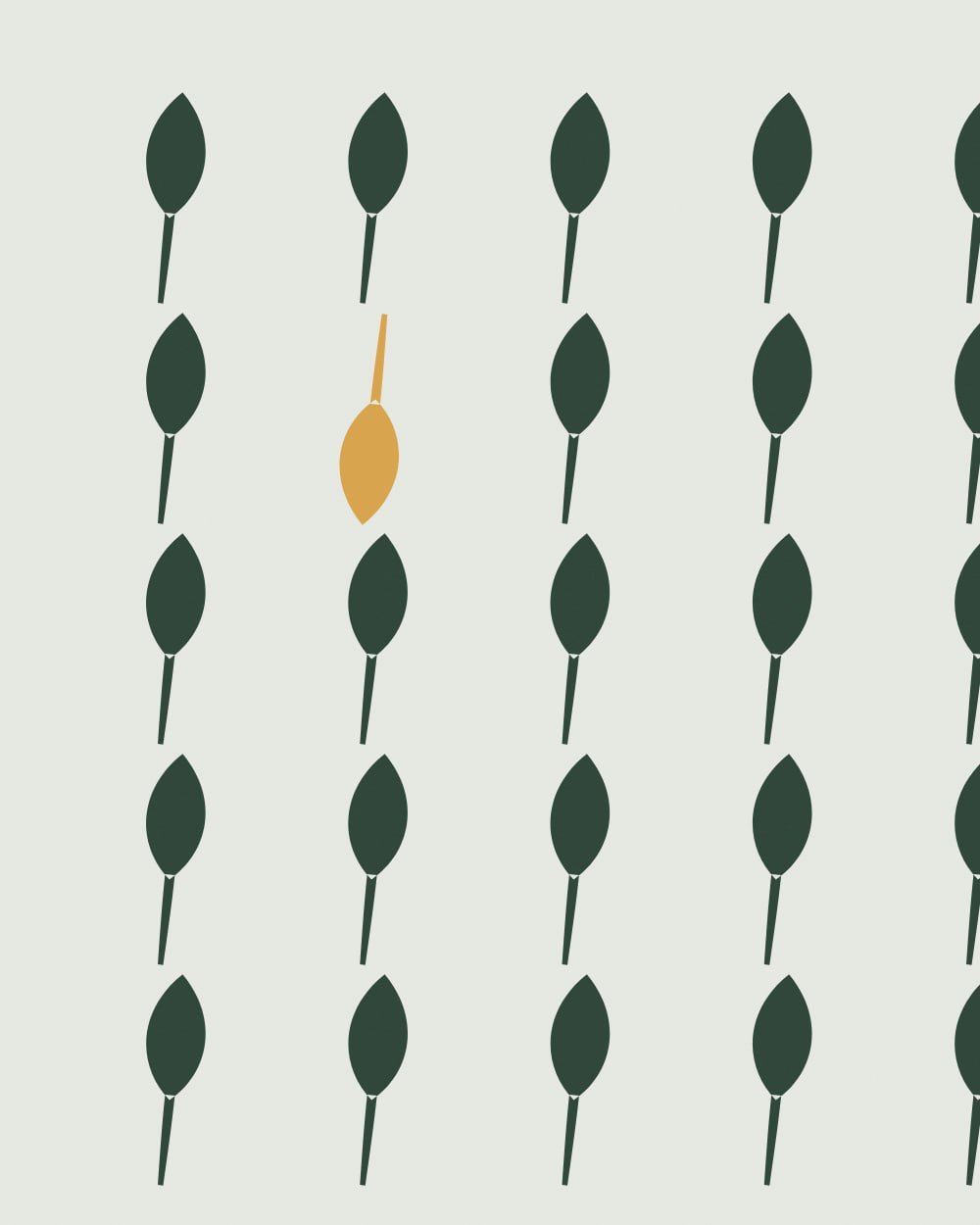
Art with a ground lighter or darker than the wall and warm accents such as terracotta, ochre, olive or navy.
Is greige too plain for a business?
It is a good backdrop. The art supplies the identity, which is why greige rooms gain the most from a strong set of prints.
How the ranking works
Every print was measured, not tagged: its colors were clustered in CIE Lab space and compared with the wall using CIEDE2000, the color-difference formula print shops use. Each bundle gets three scores. Presence: does the print stand out from this wall at a glance. Harmony: do its accent hues complement or echo the wall. Undertone: do warm and cool undertones agree. The overall match weights them 40, 35 and 25.